Exploring and analyzing data with bm-tick
Data explorer
The DataExplorer tab allows you, as its name indicates in English, to browse the data from the database, in other words the history of collected metrics.
Please refer to our documentation's page on references for collected metrics to find out more about the metrics collected and their contents.
The upper part of the window is used to write or generate the query:
- or by writing directly in the space provided
- or by selecting the desired indicators using the data browser :
- DB.RetentionPolicy: the databases you want to analyze. The most relevant is telegraf.autogen which contains the actual data. The other databases (_internal.monitor and chronograf.autogen) contain internal system data.
- Measurements & Tags: the metrics being looked for
- Fields: the field(s) required for this data
The graph with the query results is shown at the bottom of the window. It is subject to the refresh and period rules defined at the top of the page, as well as on the dashboards:

To look for and analyze a metric:
-
Select the database telegraf.autogen in the first column
-
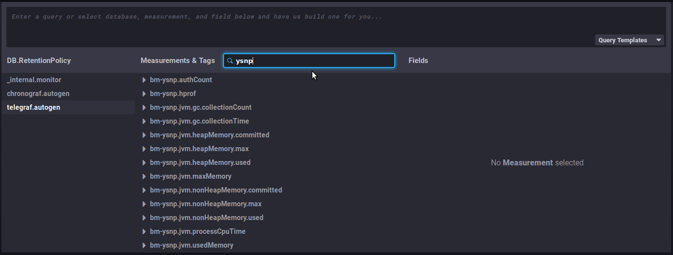
in the search field of the second column "Measurements & tags ", type, for example, the name of the BlueMind component to see which metrics are available for it:
-
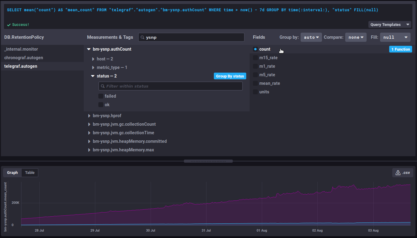
Select a metric by clicking it – e.g. "
bm-ysnp-authCount" in this instance -
You can navigate in the metric's sub-tree to refine the desired data:
-
datalocation: server name
-
host: host name or IP
-
meterType: data type, this field is particularly important as it specifies the kind of information contained in this metric
- gauge: instant measurement
- counter: incremental counter
- distsum : data pair consisting of a counter and a quantity for example:
- bm-lmtpd.emailSize = (number of emails, total size of emails)
- bm-lmtpd.emailRecipients = (number of emails, number of recipients)
- timer: same as distsum but here the amount is always expressed in nanoseconds
-
status: depending on the type of data, the status may be ok/failed (e.g. query successful/failed), success/failure (e.g. authentication successful/failed), etc.
Data grouping
💡 It is generally recommended to group the data by server by selecting the 'Group by host' button that appears when hovering over the 'host' row or by expanding this hierarchy:

This allows to group the data by host instead of obtaining an average of the data from each server. Depending on the metric being looked at, it may also be relevant to group by status, code or datalocation. -
-
Select the field in the 3ᵉ column, according to the final data required. The corresponding graph is then displayed:
Useful features/advanced queries
Changing the time interval displayed
This part of the query defines the duration to be displayed:
WHERE time > now() - 7d
This literally translates as: the data whose time is greater than today minus 7 days, i.e. the data from the past 7 days.
⇒ change to the desired number of days/hours to increase or shorten the view of the graph
Evolution of a counter
Counter data is cumulative and therefore increases regularly. In this case, it's their evolution that's more interesting than the value itself.
For example, the bm-ysnp.authCount data counts the number of authentications processed: viewing the raw data will only give you, at a given point in time, the amount of data processed since the data collection was set up, which isn't interesting in itself. On the other hand, the evolution of this figure will give us the number of authentications processed as time goes by.
non_negative_difference
To watch how this data evolves, you can use the "non_negative_difference" function which returns the non-negative difference between 2 points in the graph.
Taking the number of authentications as an example, the following graph, with no function applied, shows the average number of authentications processed by the ysnp component over the last 24 hours, by server and by status:
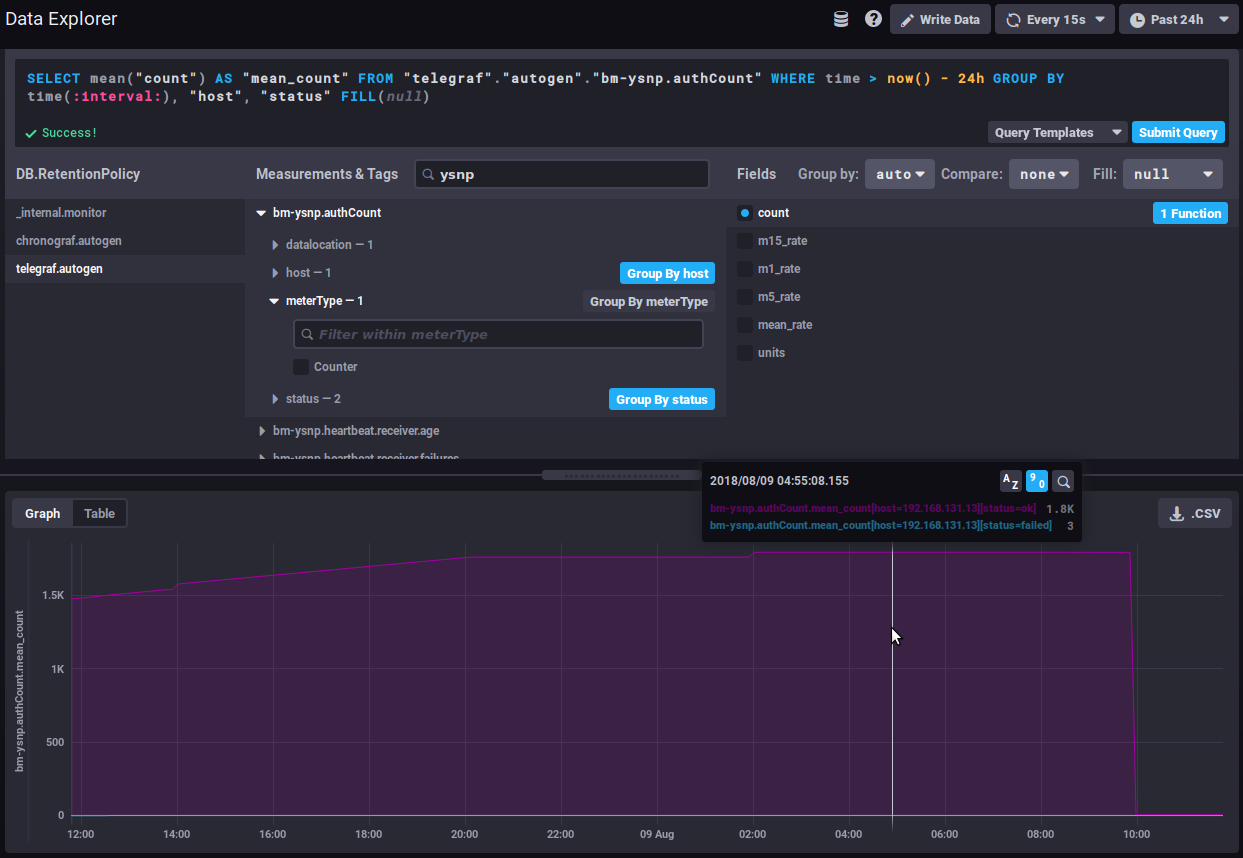
⇒ the average value keeps going up as additional authentications are being processed
Using the interval difference function, the graph then gives the number of authentications for each time interval, so we can now see how the quantity of authentications processed evolves:
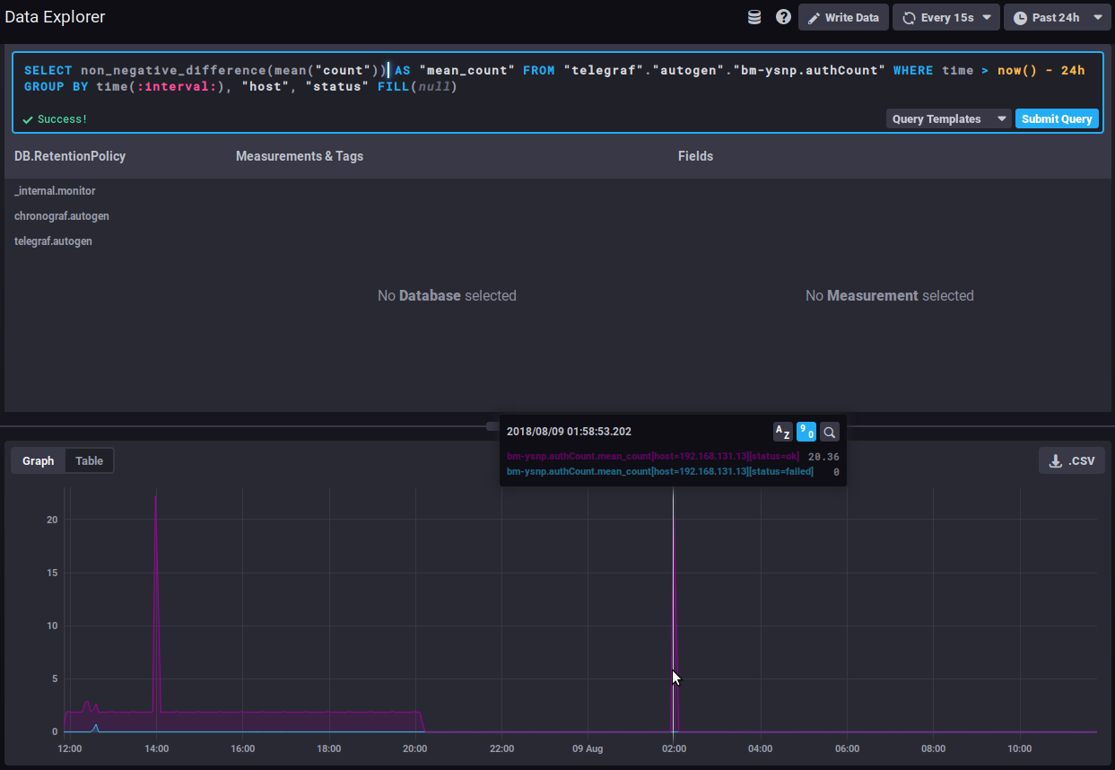
⇒ A sudden spike of "failed" in the timeline could be the sign of an attack by spammers attempting to use the server to send emails.
non_negative_derivative
Another function returns an evolution graph for field values with an additional setting: non_negative_derivative.
This function also calculates the difference between 2 points, but also allows you to specify the unit. In the non_negative_difference function, the system calculates an automatic interval based on the duration displayed ("where time...") and the data's grouping ("group by time..."). With the non_negative_derivative function, you can force-set the unit, e.g. a rate per minute, hour, day, etc.
Thus, the query below shows the average number of connections (mean("count")) per minute (non_negative_derivative(...,1m)) during the last 24h (where time > now() - 1d) for each hour (group by time(1h)):
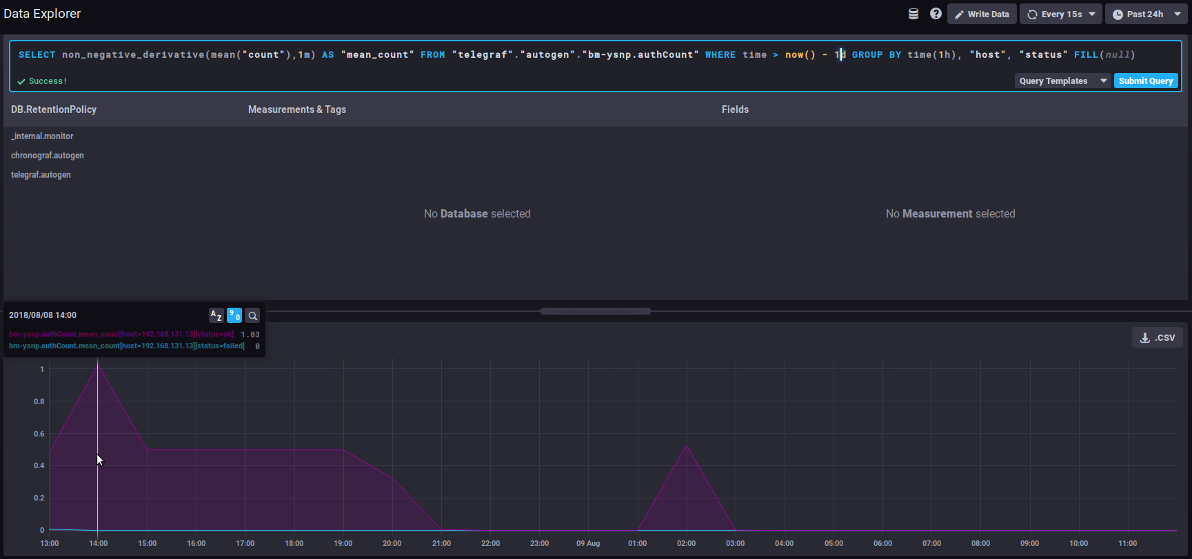
⇒ at 14:00 hours, there was an average of 1.03 connections per minute, at 15:00 there was 0.5/mn, etc.
The distsum
distsum metrics comprise 2 types of information:
- the 1st number is a count
- the 2ᵉ number is a quantity
For example, we have the following couples:
bm-lmtpd.emailSize= (number of email, total size of emails)bm-lmtpd.emailRecipients= (number of emails, number of recipients)
Take the emailSize metric, for example: with each save, the system records the number of emails counted for the interval (since the last save) and the total size the emails account for.
This data can be used to establish average sizes per email, and to determine whether the average size of emails is changing abruptly and abnormally. For example, a regular increase in average size may be observed over time, which can be attributed to improved connections, servers, user habits, etc. But if all of a sudden, in the space of a few days, the average size of emails doubles (or more), this is not normal, and we'll have to look for the reason: has a corporate signature been positioned? This may contain an image whose size we forgot to reduce, making each email that much heavier, and thus increasing the load on the servers.
Useful links
To learn more about the InfluxQL query language, please refer to the dedicated documentation :
https://docs.influxdata.com/influxdb/v1.6/query_language/
In particular, about functions: https://docs.influxdata.com/influxdb/v1.6/query_language/functions/
And grouping by time: https://docs.influxdata.com/influxdb/v1.6/query_language/data_exploration/#advanced-group-by-time-syntax
Doing more with graphs
The DataExplorer graphical tool has limited options. For example, you can't create a stacked chart to view the sum of two line graphs.
To do this, you need to go through the curves in the dashboards (see below):

Dashboards
The Dashboards tab gives you access to the dashboards. These pages allow you to group together the data of your choice.
By default, 3 dashboards are pre-configured and given as examples:
- JVMs Memory Usage : memory usage of the JVMs, here you can find the usage of each BlueMind component (EAS, Core, milter, ElasticSearch, etc.) and can monitor overconsumption or conversely the absence of data indicating that a service is stopped
- Mail insights : messaging data (number of delivered emails, average message size, etc.)
- Monitoring system status: amount of data collected, database size, etc.
BlueMind's default dashboards are reset with every upgrade.
In this way, they are recreated if they have been deleted, and reset to default content if they have been modified. If you want to customize one of these 3 dashboards, it's best to clone it (see below) and make the modifications on the clone, or simply rename the dashboard.
You can add as many tables as you like, for customized views of the data you're interested in, grouping data by type, relevance, module, etc.
Tables can be duplicated or deleted directly from the main list. When you move the mouse over a dashboard line, action buttons appear at the end of the corresponding line:

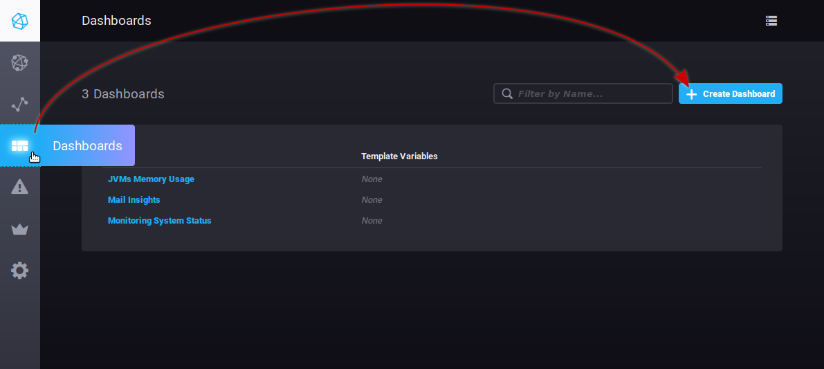
To create a new dashboard, go to the Dashboard tab and click the "Create dashboard" button:
The table is immediately created, and a new empty view is presented:
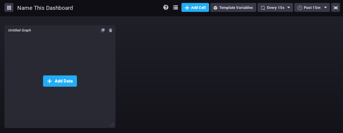
Click "Name this dashboard" to edit the box and enter a name for the dashboard:

To add a graph in the existing area, click ![]()
The query editor opens. You can create a query either by typing a command or using the database browser. A view of the graph is shown in real time:
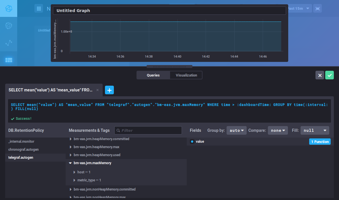
This editor is similar to the DataExplorer's. Please refer to the previous section for metrics search and query building.
The "Visualization" button is used to choose a graphic type and customize it:
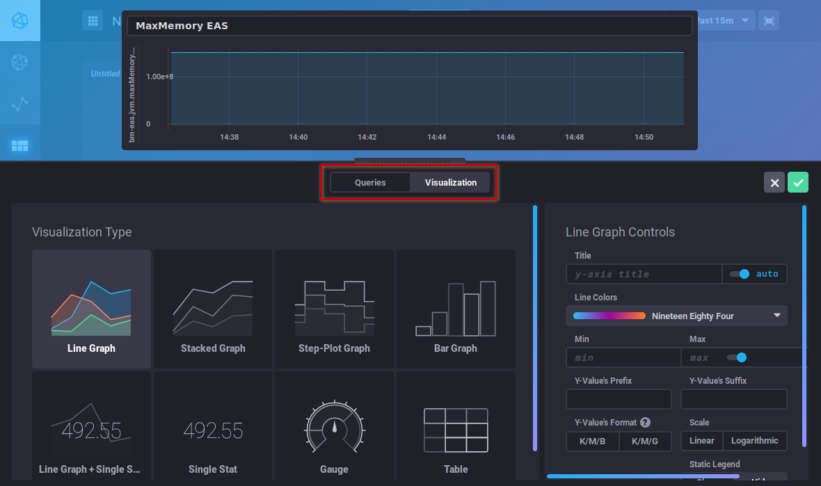
Once your graphic has been created, click "Save" in the top right corner of the editor. The graph is saved and added to the area:

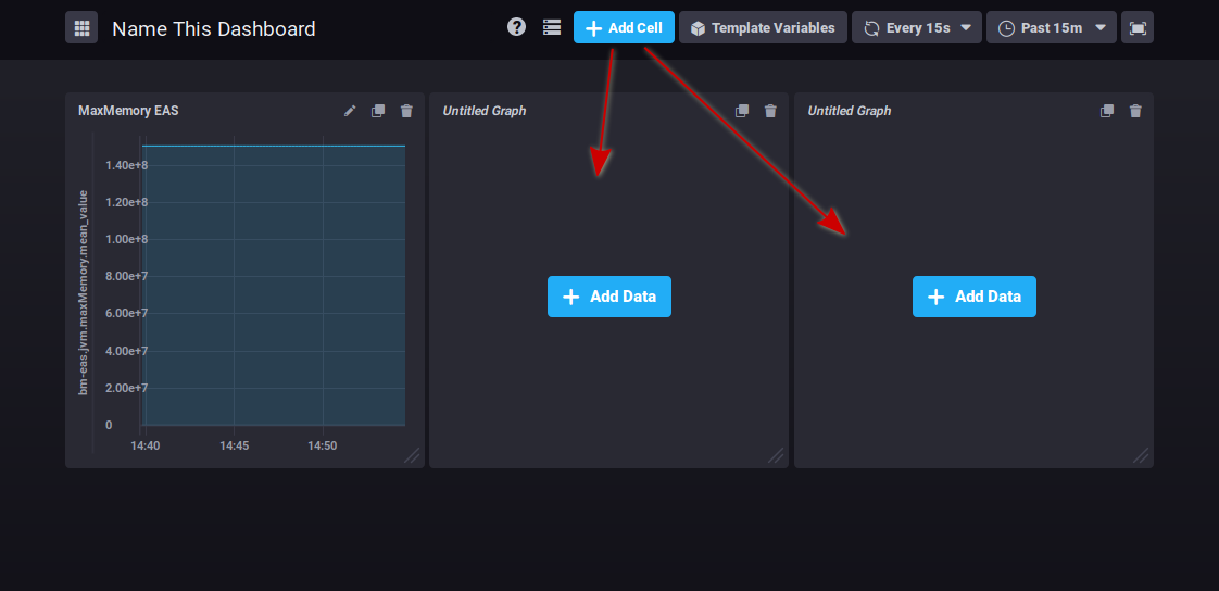
Click ![]() to add as many graph areas as you like:
to add as many graph areas as you like:
At the top right of each cell, buttons allow you to :
 : edit, add comments or download csv data
 : clone the graph. A new area containing the same graph is added at the end of the dashboard
 : delete the graph
Click on the desired icon to bring up the menu of possible actions.
Graphs can be reorganized by clicking the title area and dragging and dropping them as desired:

There's no button to save changes: all modifications are saved as you go along, so you don't risk losing all the work you've done if you forget to save.
Les alertes
The Alerting tab is used to manage alerts as well as alert history:
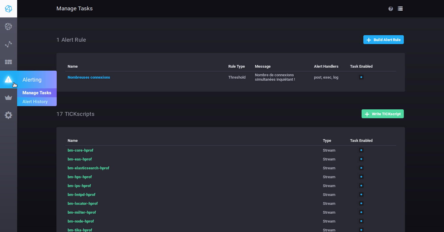
Alerts can take the form of scripts or alert rules.
By default, no alert rules are present at installation, but a number of scripts are pre-configured, so you can modify and/or add as many as you like.
BlueMind's pre-configured alerts are important warnings of server health, and special attention should be paid to them if any are raised.
Les alertes
- To create an alert, click

- To edit an alert, click its name in the list.
Then fill in (or correct) the various parts of the form:
- Name this alert rule: alert name
- Alert type: described below
- Threshold: an alert will be triggered when the data reaches, exceeds or falls below the set value
- Relative: relative to its own history – an alert will be triggered when value changes exceed set conditions
- Deadman: an alert will be triggered when no data is detected within the set period
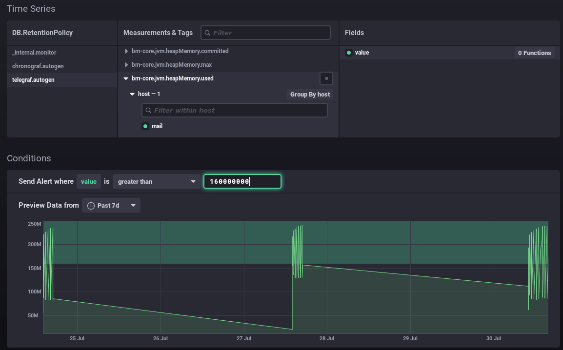
- Time series: use the navigator to find the relevant series
- DB.RetentionPolicy: the databases you want to analyze. The most relevant is telegraf.autogen which contains the actual data. The other databases (_internal.monitor and chronograf.autogen) contain internal system data.
- Measurements & Tags: the metric being searched for, a box at the top of the column can be used to filter your search by name
- Fields: the field(s) required for this data
- Conditions: once you have selected the field, set the conditions according to the type of alert chosen earlier. When you type a value, a real-time display of the data collected is shown which can help you set or adjust the value.
For example in the form below:
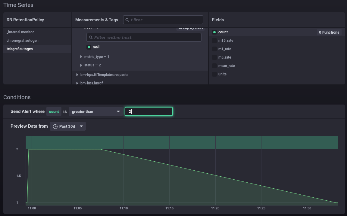
- You want to set up an alert for when the number of connections is more than 2.
- The graph shows the number of connections over the previous month (green line).
- The green area at the top highlights the area for which the alert would have been triggered.
⇒ I can see that my values have always been below this level, and it would be abnormal for them to exceed it, so the alert seems relevant to me at this threshold
In this way, you can position your value as best as possible according to your data and its history: above the usual values, including peaks or not, etc. In this second example, an alert will be raised when memory consumption peaks every few days:
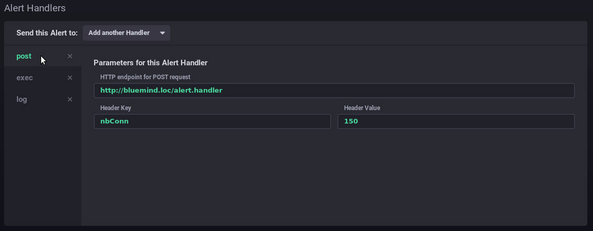
- Alert handlers: managers have to do Add thanks to the list of one or more alert recipients:
- post: sends a "post" http alert to the url provided
- tcp: sends a request via tcp to the address indicated
- exec: command line to run on the server
- log: write a message to the indicated log file
- ...
In this example, the alert sends a http request, runs a command on the server and writes a message to the dedicated log file:
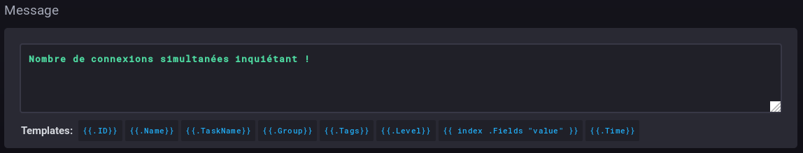
- Message: the message to write or send via the handler(s) specified above:
Scripts
Scripts enable more detailed and expert alert management. Each alert created as a rule is also present as a script and can be edited in this way.
- To create a script, click

- To edit a script, click its name in the list.
For more information on scripting, please refer to the product documentation :
- https://docs.influxdata.com/kapacitor/v1.5/tick/
- https://www.influxdata.com/blog/tick-script-templates/
Alert history
The Alerting > Alert history sub-menu is used to access the history of alerts triggered:
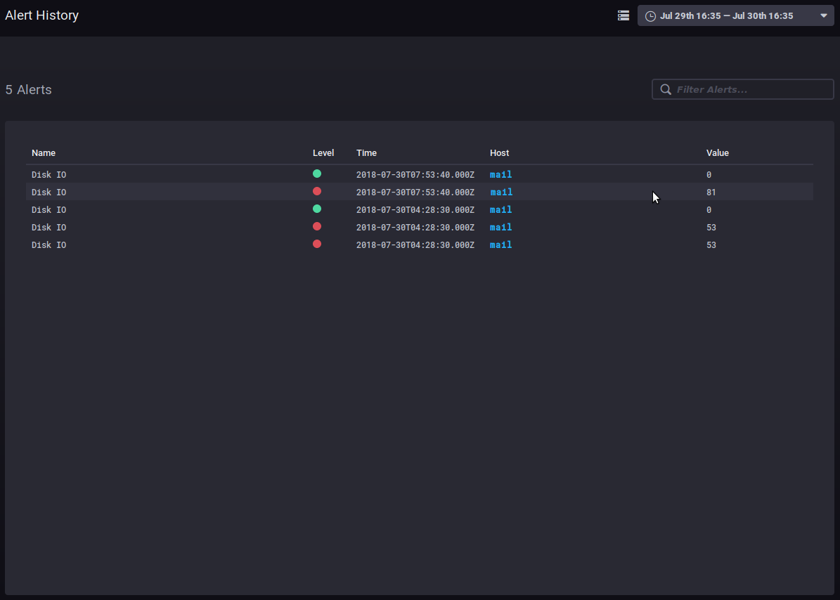
The history allows you to see the name, level, time, host involved and data value when the alert was raised.
Clicking on the host name takes you to its supervision dashboard.
Other tabs
Hosts
The Host List tab shows the list of monitored host servers, with the apps they include:
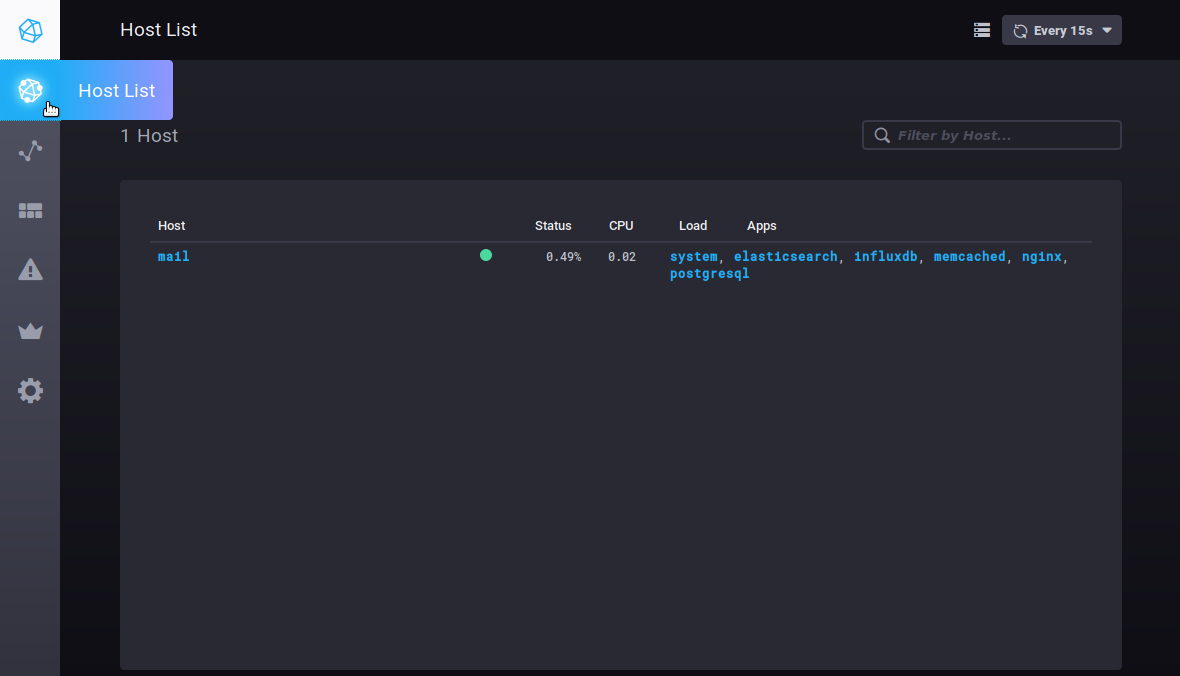
Clicking on a server or application takes you to its specific dashboard.